Philosophy & Identity
About Bloom.
Bloom exists as a composed digital space — a brand identity grounded in calm authority, clear structure, and measured atmosphere.
When we set out to extend Bloom's digital experience across multiple pages, our single guiding rule was simple: do not change what made Bloom resonant in the first place. This page outlines the philosophy behind that choice.
Core Purpose
Built for visitors who value control over spectacle.
Most digital platforms respond to short attention spans by shouting — adding brighter colors, faster transitions, and constant visual noise. Bloom takes the opposite path.
We believe that a brand experience feels more memorable when it treats the visitor with respect: giving them space to read, time to observe, and interactions that feel like natural extensions of the content.
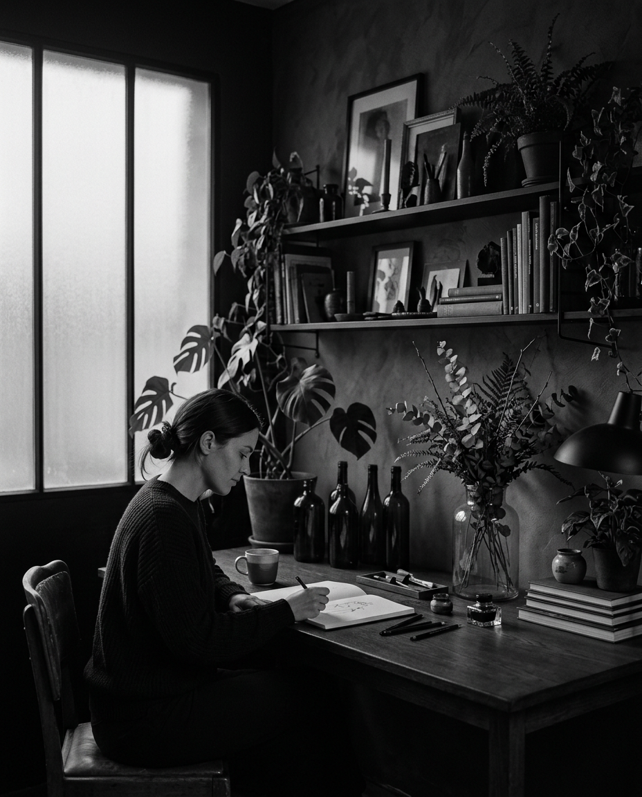
The Promise
Protecting what works while enhancing how it feels.
A brand's identity is fragile. Swapping typefaces, rewriting established claims, or forcing trendy visual gimmicks destroys the familiarity returning visitors rely on.
That is why every word, color tone, and typography rule from Bloom's origin remains unchanged. The enhancement sits in the runtime execution: faster perception, softer scroll entrances, and fluid state changes that feel like second nature.
Typography
Poppins for structure, Source Serif 4 italic for quiet emphasis.
Palette
Strict grayscale tones, liquid glass blur, zero visual noise.
Crafting Interaction
Every animation has a job to do.
If an interaction doesn't clarify where a visitor is or what options are available, it doesn't belong on Bloom. We evaluate every motion against three simple criteria:
1. Does it orient the reader?
A progress fill tells you how deep you are into a long thought. A counter signals scale without forcing a wall of text.
2. Is it non-intrusive?
Particles float slowly in the background. The hero typewriter types at a human cadence. Nothing jumps abruptly.
3. Can it be dismissed?
The menu overlay opens full-screen but removes itself instantly when closed, leaving no DOM footprint behind.
Engineering
Vanilla JavaScript, lightweight and controlled.
We chose vanilla JavaScript over third-party animation runtimes to keep Bloom lightning-fast and completely predictable across devices.
By controlling every DOM mutation, class toggle, and inline transform directly, Bloom delivers 60fps interaction without the overhead of heavy external scripts.

Tone & Language
Elegance in concise language.
Bloom speaks like a thoughtful host: confident, design-aware, and economical with words. We state facts clearly, avoid buzzwords, and let the typography breathe.
This editorial approach ensures the content feels elevated without becoming abstract or distant.
Audience
Designed for first visits, returning readers, and detail lovers.
Whether you are discovering Bloom for the first time or revisiting to explore our approach in detail, the site adapts to your pace.
See The Work